Color Theory For Mixing Paint: Part 1
- haleyindorato
- Mar 11, 2024
- 4 min read
Basic Color Theory Tips to Help Mix Colors Better
As you can most likely tell from my work, I really like color. When I paint, I rarely use a color straight from the tube. I’d say 95% of the time I’m mixing colors to get the one I need. To start understanding how to mix paints, let's look at a color wheel to understand basic color theory and common terms.

This is a very basic color wheel. Red, blue and yellow are primary colors. They cannot be made from mixing two colors together. Everything else can be made from different color combinations. In grade school art classes you’ll talk about secondary colors (orange, purple, green) and tertiary colors (yellow-orange, blue-green, etc).
“Complementary” here means "the opposite". In practice, most colors are never true opposites. However, when mixed two complements should make black. That’s why you can use a complimentary color to darken the color you are using. Like adding green to red.
In beginner design classes in college you talk about different color combinations. Like analogous (next to), triadic (equally spaced), split complementary (a color and the two colors next to its complement), etc. These are mostly used for designing an overall painting. Most of my work is currently from life and my subjects are chosen intuitively, so I rarely use color schemes. That being said, I still carefully arrange and select the best references or objects and colors that will create the most interest.


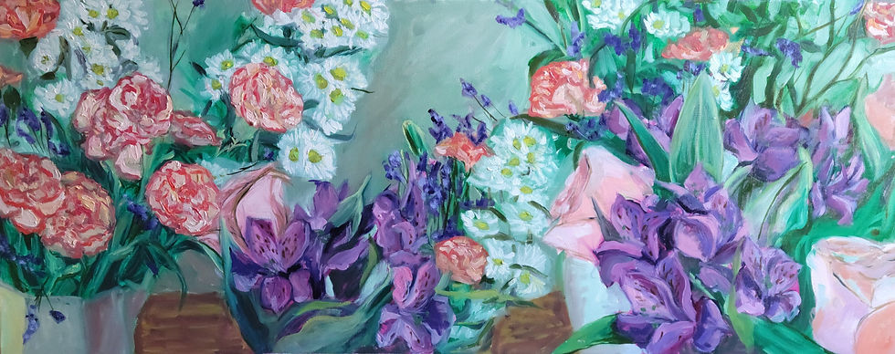
For example: take my recent painting, “Carnation, Daisy, Carnation, Limonium.” I painted this from life with flowers I bought from the grocery store. Before I even touch the paint, I’m already spending (arguably too much) time selecting the flowers. The oranges, purples, and greens that are dominant in the flowers is an example of a triadic color scheme: they’re about evenly spaced on the color wheel. I selected these specific colors because I personally liked the combination, and also knew the contrast would be readable.
The painting “Flower Horizon” is primarily green or green tinted, and the reds and purples could be described as split complementary. Contrasting colors, when used minimally can become landmarks or focus points in the painting; important for creating movement in the piece.

You may have heard of “warm” and “cool” colors. This idea is more like the brain associating red and yellows with warm things like fire, and blues and greens with cool things like water. “Warm” and “cool” is important for the feeling you are trying to give a painting. For “happy” or “energetic” feelings you’d most likely choose warmer colors. Cool for sad or slow. In practice most paintings are very complex. This isn’t even a guideline for making a painting, just a way humans associate color with things.
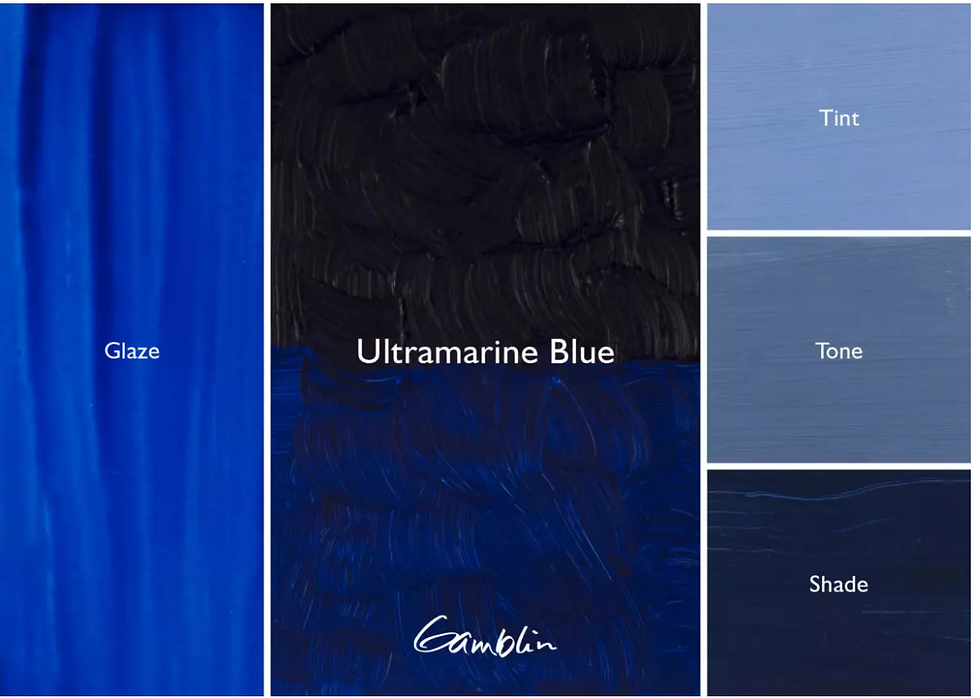
It does help to notice that some versions of the same color or “hue” (e.g. blue) have different temperatures. In paint this would be phthalo blue (warm) versus ultramarine (cool). I know it can be hard to see... but it is a real thing.

In art school they tell you to transition from warm to cool in addition to value. This makes shadows have more depth and adds interest to the painting. When painting from life, if you get good at looking, you’ll notice when a light source is cooler, the shadows usually are warmer with some red in them. And when it’s warm, the shadows are often cool and blue.
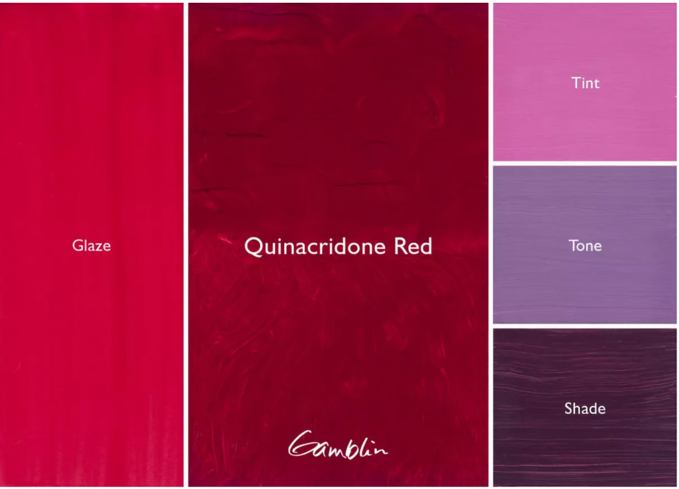
This wheel also shows what happens when you add white (tint) or black (shade) to the color. Especially with paints, the color can change a lot when you add white, or even when you add a lot of medium to thin the paint. Colors like Quinacridone Red or phthalo green, two of my personal favorites, look very different when you add white.

When learning in art school, they tell you to never use black. You have to mix your blacks. Black, like everything else, can be more red, or blue, or green. This adds complexity and depth to the painting. If you want a color darker, like I mentioned earlier, it’s better to use complementary colors. The combination I use the most that gives a deep black is burnt sienna (an orangey-red brown) and ultramarine blue (a cool blue).

Finally, this is the Munsell color chart. It’s not so much a wheel anymore. The colors are placed on different levels based on their values: how dark or light they are. A yellow straight from the tube is a lot brighter and can be used for highlights while a blue out of the tube is very dark and would be used for shadows. Because of this, you typically would not use yellow for a shadow, at least in realistic paintings.
After all this it’s important to remember painting has no rules and color is all relative. All colors are influenced by what is next to them. Paintings don’t have to “be real”, they usually just have to make sense in their own world.


Comments